Company news

Reappearance of "Crystal Palace" Nantong Renheng Land Marketing Center
Reappearance of "Crystal Palace" Nantong Renheng Land Marketing Center
Project Overview:
Project Name: Renheng Nantong zhongchuangdi century marketing center and model house curtain wall project
Address: Zhongchuang land century project at the intersection of Century Avenue and Taiping Road, Nantong
Owner: Renheng land group
Project area: 3200m2
Hard / soft design: HWCD
Main design: Rita Fabiano
The first "Crystal Palace"
Signed a contract with Shaoxing Shengzhou Rongxin marketing center on September 26, 2017, adopting 260 * 90 * 8mm ultra white tempered frosted U-shaped glass 4500 flat.
Won: 2017-2018 Fourth "real estate design award · China" - Excellent Award
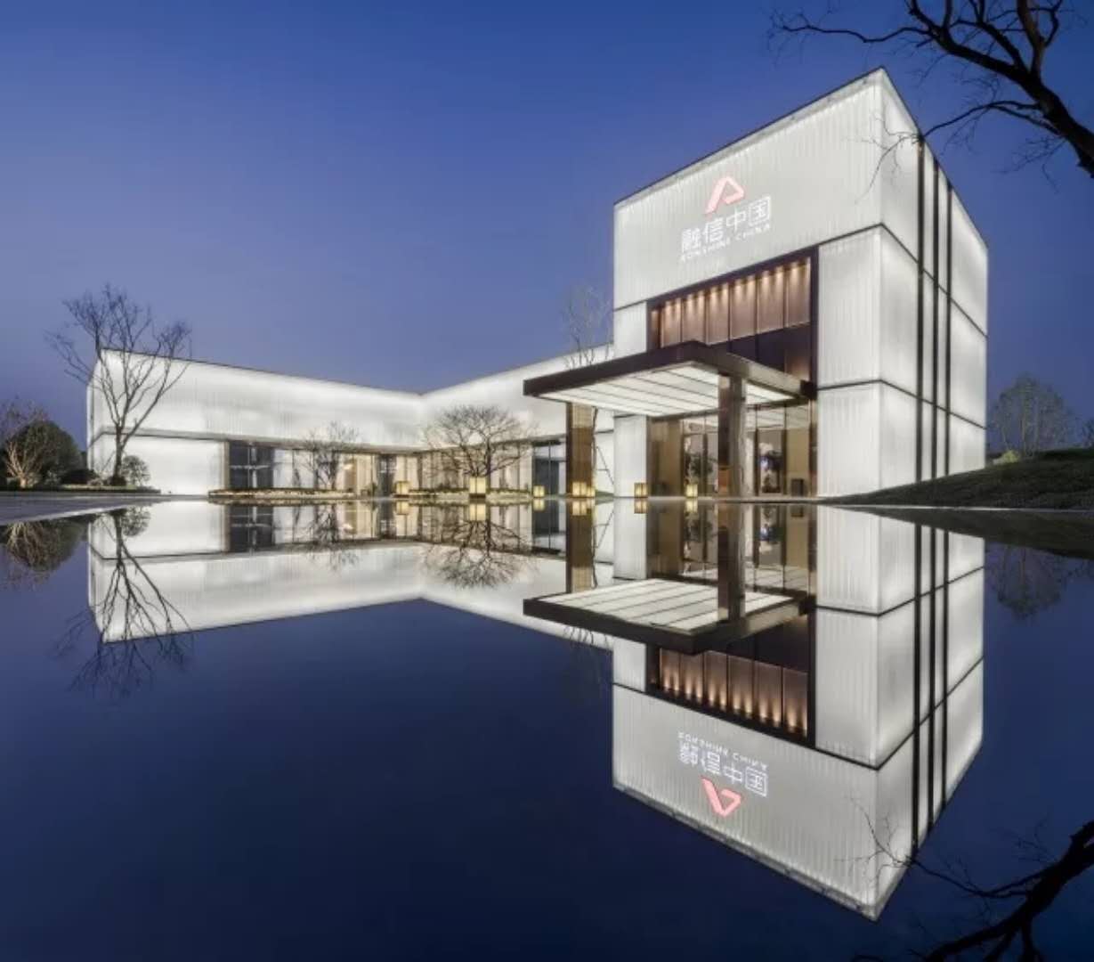
Reappearance of "Crystal Palace" Nantong Renheng Land Marketing Center
In December 2018, the company signed a contract for U-glass project of Nantong Renheng land marketing center, using 330 * 70 * 7mm ultra white tempered Mongolian sand U-glass of 4000 square meters.
Corbusier——
"Architecture is a kind of artistic behavior, an emotional phenomenon, beyond the problem of construction."
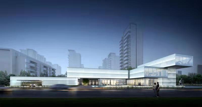
△ facade effect drawing of century marketing center of Nantong Renheng land
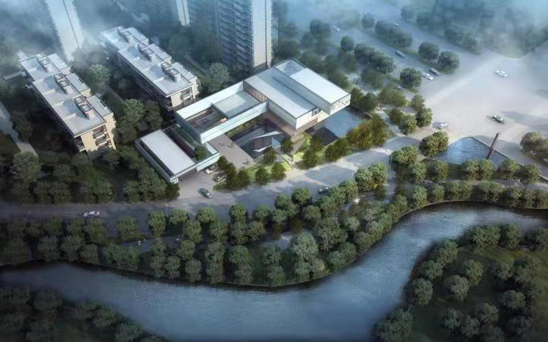
△ overall effect of Nantong Renheng land century marketing center
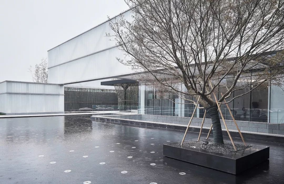
△ the facade of century marketing center of Nantong Renheng land
Plane plan
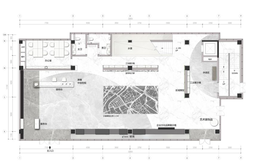
△ F1 plan
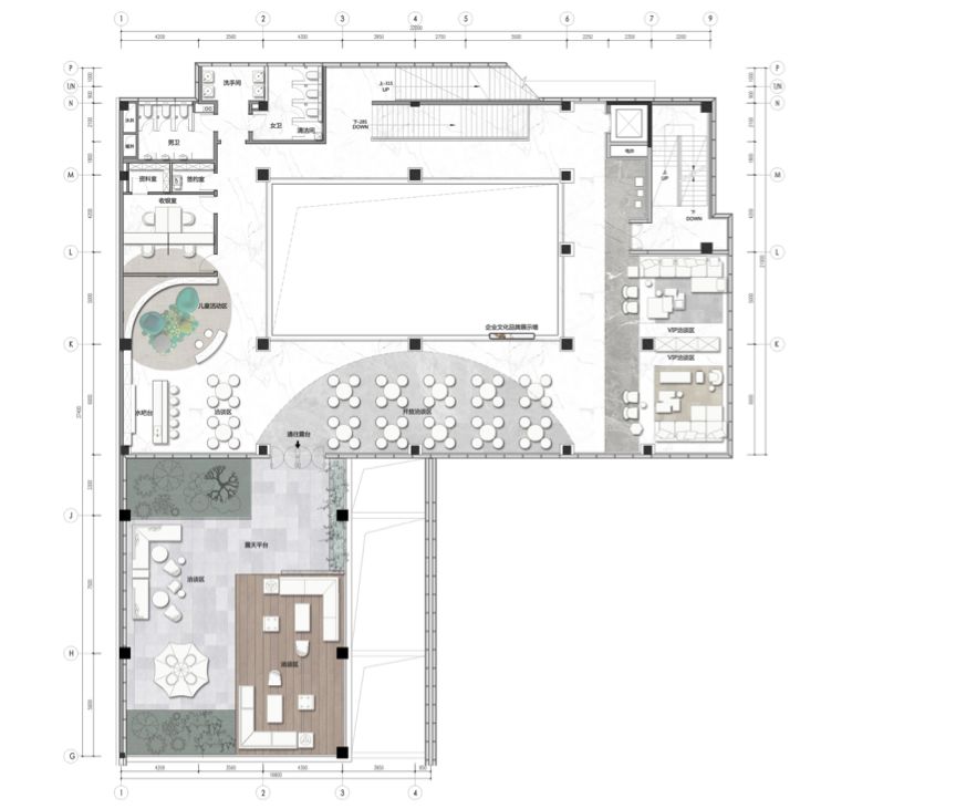
△ F2 plan
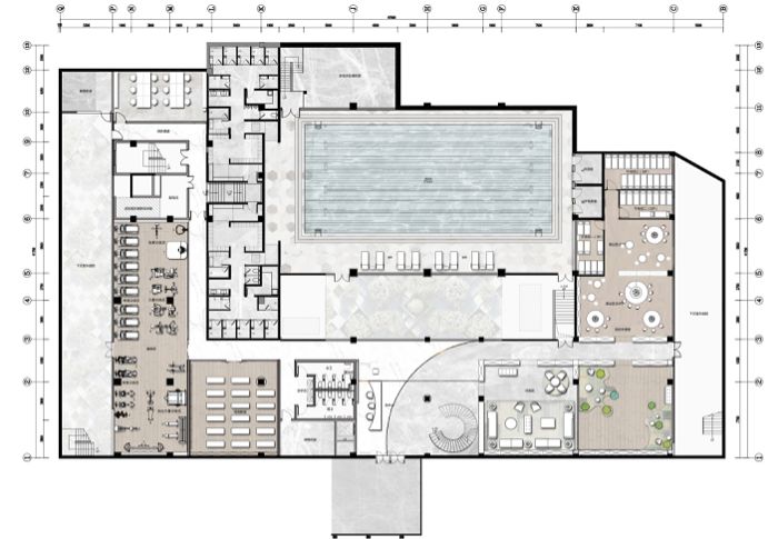
△ B1 plan
Elevation map


Renheng land century marketing center is located in the central Innovation Zone of Nantong City, the ancient capital of Jiangsu Province. HWCD takes architecture as a bridge to carry the history and future of the city.
Designers use minimalist structuralism to explore the integration of city and art. The so-called art meets confidant is to convey modern life style through the beauty of space.
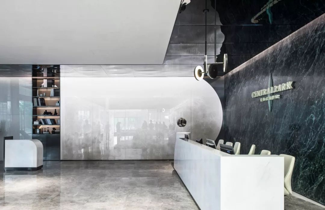
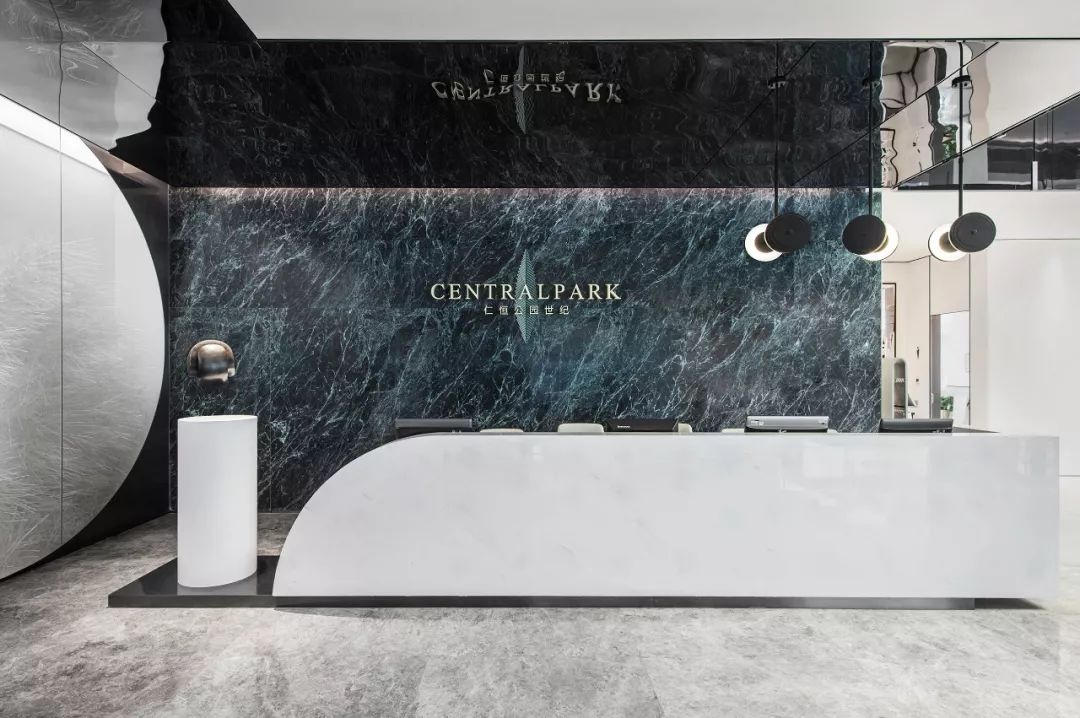
△ reception area
As the initial impression of the marketing center, the reception area of the front desk outlines the sharp three-dimensional line sense with the shape of arc and straight line. Combining the metal mirror ceiling with polished marble, this paper makes an interesting space discussion.
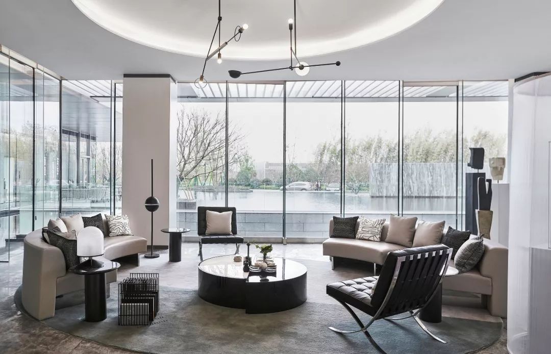
△ waiting area
The oval waiting area creates a rhythmic visual effect with simple irregular lines. The placement of giant floor glass and Barcelona chair implements Mies van der Rohe's minimalism.
Break the traditional architectural design of the closed space, large-scale use of glass and metal and other transparent and reflective materials to resolve the boundaries inside and outside the building.
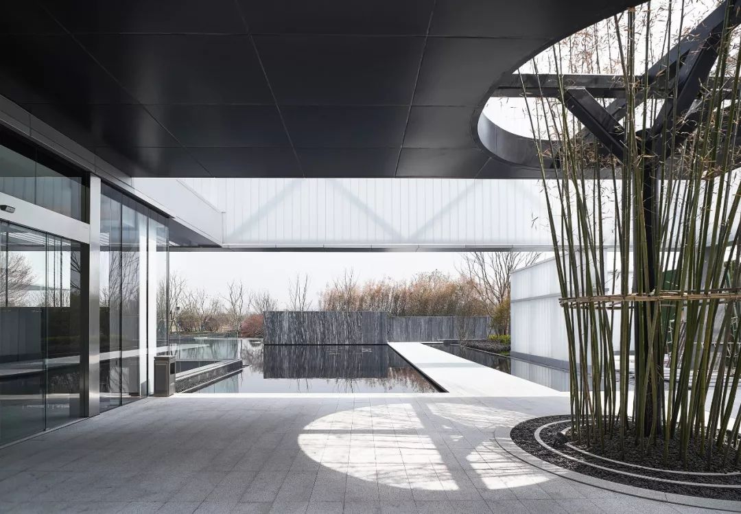
△ outdoor
The outdoor space uses ingenious geometric segmentation and light and shadow changes to ensure the overall openness and build a harmonious relationship between the inside and outside of the building. The layout of waterscape creates a mirror effect visually, emphasizing the overall art form.
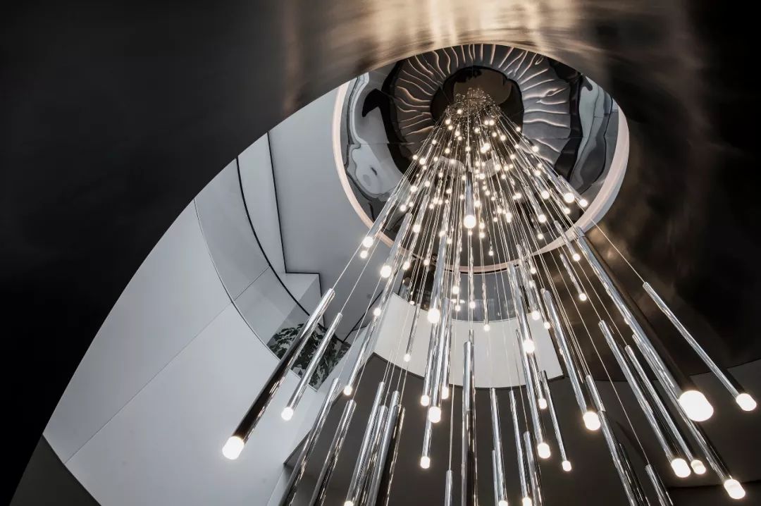
△ art stairs
High contrast black and white create a spiral art staircase, and place the giant chandelier in it, just like a dazzling star river pouring into the mysterious black night, causing infinite reverie.
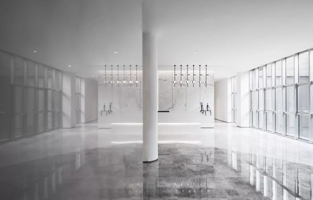
△ service desk
Removing unnecessary elements, the display wall and service desk have no unnecessary decoration, no complicated decoration, and only large area of blank space and the most concise and powerful lines express the core of structuralism.
The design of mirror space depends on the structure, but it is not limited by the structure, but comes from it and deduces the essence of minimalism.
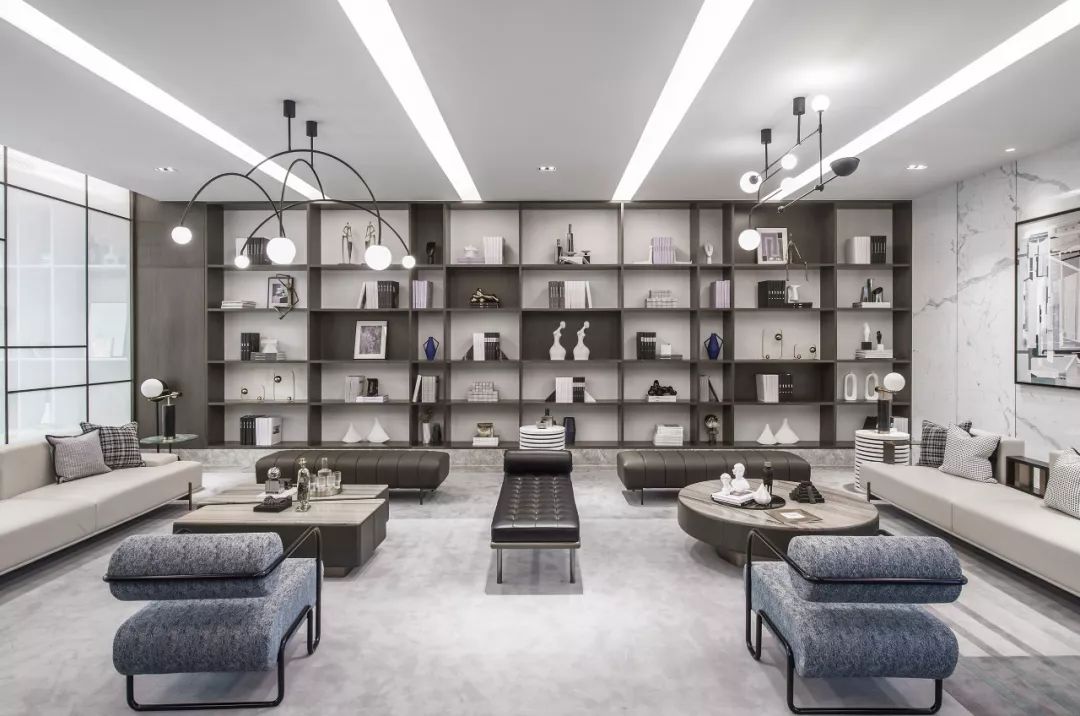
△ B1 negotiation area
B1 negotiation area is designed to create a comfortable negotiation space with neutral color. Marble and leather, wood and cloth art, different materials combine with unique modern life style and taste in the collision.
In the same space, although there is no obvious partition, the designer naturally divides the space function through the ingenious combination of geometric modules and lines. The separation effect of part and whole is not only independent, but also a whole.
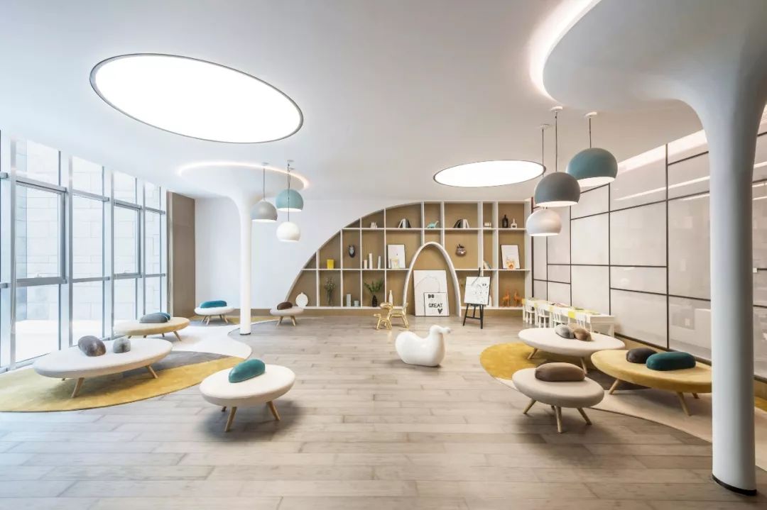
△ children's rest area
Soft arc and irregular ellipse create children's activity area. The designer adds bright warm yellow to increase the interest of the space. It is only one wall away from the negotiation area, and it is designed as a translucent partition, so that parents can see the scope of their children's activities at a glance while communicating.
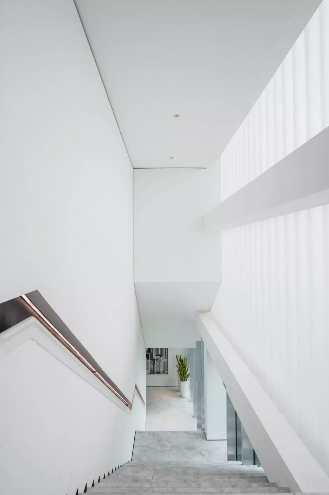
△ staircase
The smooth and simple stair space with a sense of line structure is harmonious with light and shadow with high-purity white space. Through the linear features and visual perspective, a huge half open and half closed modern space is created.
Art sculpture, which is made up of irregular geometry, is like the essence of structuralism. The seemingly separated parts are often not disordered and disordered.
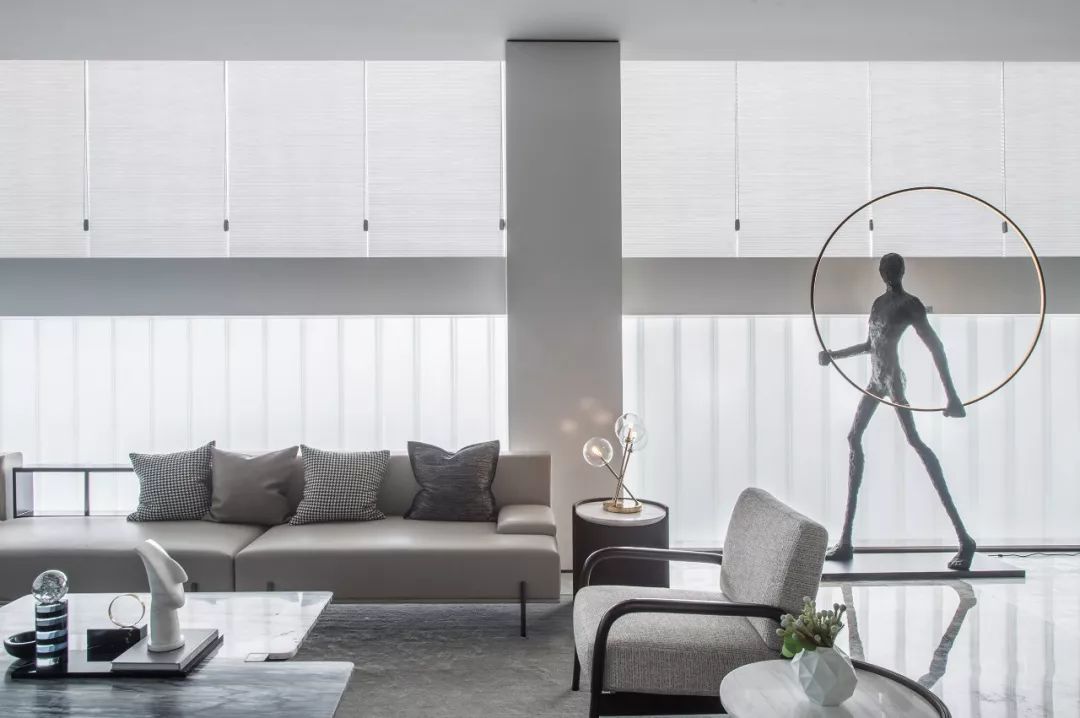
△ negotiation area on the second floor
In the design of the negotiation area, the structuralism and functionalism of modern architectural aesthetics are combined. The dark antique frame is used as the partition and the beige white sofa group is used to strengthen the sense of visual hierarchy. The dome lamp and the placement of sculptures make two different geometric forms of "square" and "circle" talk in space.
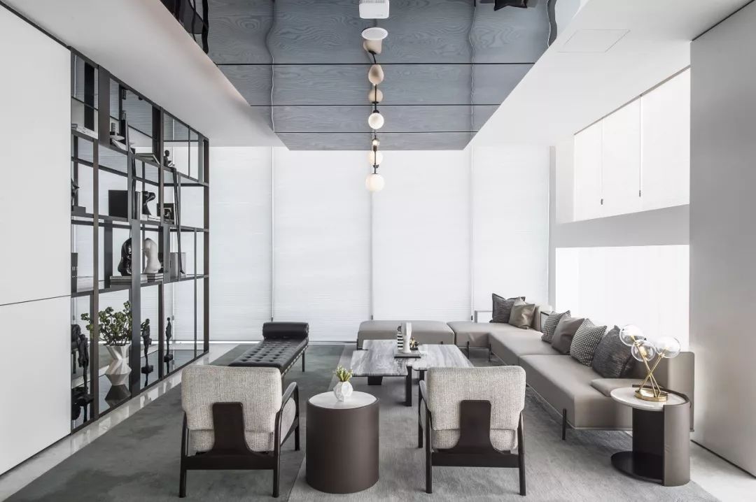
△ discussion area and water bar on the second floor
Stepping into the discussion area, the space rhythm is simple and clear, and the fabric and stone materials are properly combined, which seems to be a random mix and match, in fact, enriches the space level and highlights the overall functional diversity.
The art form of structuralism creates a unique modern architectural aesthetics, and HWCD uses the integration of points, lines and surfaces to form the starting point and transition of space.
內(nèi)容摘自/HWCD

